Tuesday, June 9, 2015

How to Get Users to Embrace Your Offer (Without Resorting to Shady Marketing Techniques)

We’ve all seen them. Those questionable sites that throw a smattering of popups and lightboxes and offers at us in an attempt to reel us back in. We simply can’t go unless we get their free e-book, sign up for their newsletter, or we’re otherwise happy with the situation that caused us to click them in the first place.

junk

Because nothing says “Make Money Online!” like disembodied happy people!

But why resort to these kinds of last-ditch effort techniques at all? Most usability experts would have you roll out the red carpet to your prospects and pepper them with deals and discounts, but I’d like to propose a different idea – getting them so accustomed, familiar and eager to do business with you gradually – until it seems so easy and convenient, they’ll wonder why they didn’t think of it in the first place.

This process is known as User Onboarding, a term coined by designer Samuel Hulick. The story goes that Samuel was considering using online accounting service LessAccounting, but he struggled during the sign up process – so much so, that he wrote a review about it on his site. It was useful and informative, but didn’t back away from necessary criticisms either. Word spread to LessAccounting’s co-founder, who (much to Samuel’s surprise) was thrilled with the review and started making the necessary changes on the site right away.

The original video “tear down” review of LessAccounting

So how can you leverage the user onboarding process for your own site and get prospects to go from casual browser to engaged buyer? And how does this differ from other techniques like remarketing? Let’s take a closer look at some techniques you can put to use right away.

The Key Difference Between User Onboarding and Remarketing/Retargeting

Both remarketing and user onboarding have a lot of similarities. They’re both encouraging users to take the next step toward a conversion. However, the user onboarding process involves much gentler guidance, whereas remarketing is more of a nudge – it could be welcomed, as in “oh! I forgot I had that in my cart!” or a mild annoyance, as in “I abandoned my cart because the price was too high – leave me alone!”

So how do you walk the line between (un)welcome reminder and gentle guidance?

Let the User Make Purposeful Progress

If you have a considerable number of steps in your sign up or registration process, using progress indicators can help. Progress indicators are non-intrusive, and give users a meaningful goal to reach. Many apps, services and memberships leverage progress bars to give users a clear indication of where they are in the process, how many steps are remaining and how to continue.
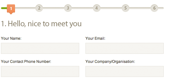
progress-stepsProgress steps give the user a clear indication of what’s next – and a goal to move toward

Show Them What They Get (Instead of What They Don’t Get)

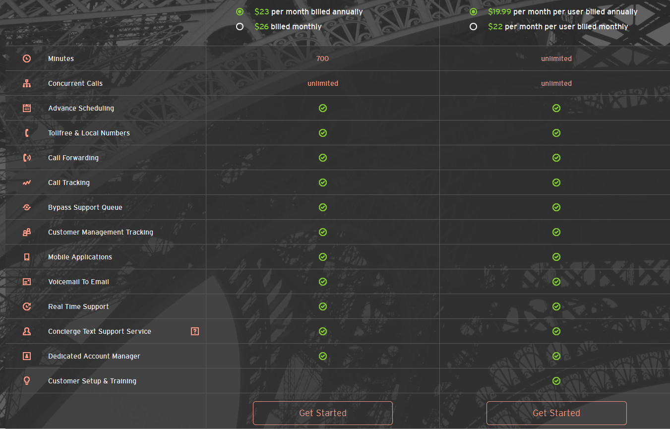
Many sites use feature comparison charts as a way to show users the differences between packages and pricing. Oftentimes you’ll have a scattering of green checkmarks and red X’s to show what’s included. But what if you only concentrated on the positive by showing users what they get, as opposed to what they don’t get?

Vonjour, a phone and text messaging service, does this with their plans. This not only alleviates the pain points of “look how restrictive this package is” but gets users excited from a value standpoint with “look at all the things that are included!”
vonjour

Just look at all the features you get!

Be Careful With Settings and Controls

If you want to improve the user experience with your app, system or software, be careful about giving the user too much control, too soon. While it’s possible that most users will want to dive right in and play around, oftentimes, cumbersome tooltips, popups and other instances will clamor for their attention instantly. It can be almost instinctive to click the “do not remind me again” box and then forget where to go to pick back up the process later.

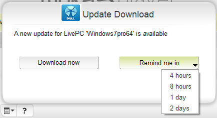
Dell’s LivePC does a good job of reminding the user without being too insistent or interruptive, by giving them several options to choose from for a reminder.
livepc

Live PC lets you pick a reminder time that’s convenient for you

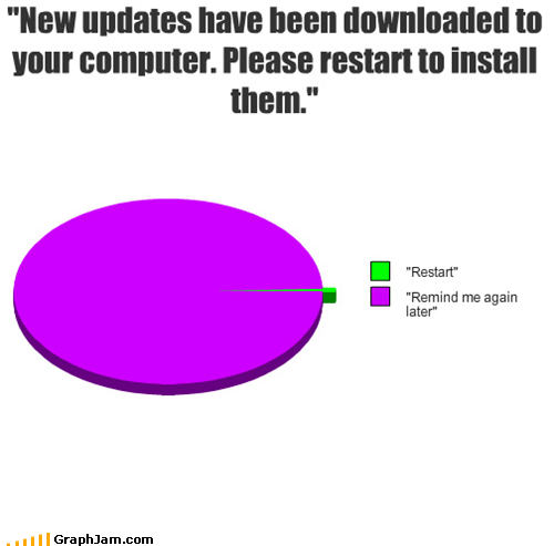
Microsoft, however, failed to get the memo:
dont-remind-me

Still waiting for that “Don’t Remind Me Again” button…

View the Process from the User’s Perspective

What happens after the user clicks your call to action? For many sites, users are directed to the next step or feature that the service assumes is the best choice for them. It can seem like a no-brainer to propel the user toward embracing certain features – after all, those are the very things that set your service, app or product apart.

However, remember that from the user’s point of view, all of these questions and features can seem confusing or unnecessary. From their perspective, asking them to “tell us your email address (so that we can customize your experience)” or “Give [service] permission to access your email contacts” are more uncomfortable and intrusive than helpful. “Customize your user experience” – what does that even mean? How will you customize it? How will you help me to do the very thing that caused me to sign up with you in the first place?

If you can’t answer that question – users will simply give up and turn their account into a ghost town.

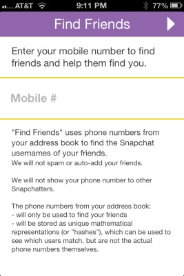
Look at how SnapChat handles this request in a more human way – “Do this, so that we can help you do that” – Enter your phone number so that we can help your friends find you (and vice versa)
snapchat

In addition, the less barriers to entry you can throw up in the user adoption process, the higher your conversion rate can be. Our own KISSmetrics login system uses Google to circumvent the creation of yet-another-username-and-password which can be distracting and herd the user away from the original goal. As a result of using this social login system, our conversion rate ranged from 44-82%.

km quantify

KISSmetrics achieved an 82% improvement in user onboarding by using a social login system

The Final Thought on User Onboarding

As a general rule, the more human, open and friendly you can make the process – whether it’s a demo, a login or a tool, the more people will be willing to take the next steps. Remember, people are more likely to do things that are in their best interest and benefit immediately, rather than waiting and hoping they have the opportunity to go back at a later date. Once you have their attention, treat it like the precious commodity it is and work with them to turn them from casual users into brand evangelists!

Have you spotted a great example of user onboarding? Tell us about it in the comments below!

About the Author: Sherice Jacob helps business owners improve website design and increase conversion rates through compelling copywriting, user-friendly design and smart analytics analysis. Learn more at iElectrify.com and download your free web copy tune-up and conversion checklist today!

Monday, June 8, 2015

How to Identify and Fix Friction on Your Landing Pages

Landing_Page_Friction.jpeg

You’ve spent a lot of energy (and budget) getting targeted traffic to your website.

Unfortunately, those visitors aren't doing what you want them to do when they get there.

But why?

Often times this comes as a result of landing page friction -- a barrier that prevents your visitors from completing the action you'd like them to take.

Whether your copy is too long, your button text isn't compelling enough, or you're lacking social proof, you need to start by identifying the points of friction before you can turn them around.

To help you get a better grasp on what landing page friction looks like, when it can be used to benefit your business, and how to resolve it when it's hurting your conversions, keep reading.

When Negative Friction Is Good

Negative friction point, you say? Aren’t all friction points negative? I disagree -- friction can be both good and bad. For example, a commonly stated cause of negative friction on landing pages is long submission forms.

If there's a lot of information to hand over when visitors arrive on the landing page, there is little incentive for them to complete your call-to-action. This state is often referred to as “psychological resistance.”

Do visitors feel like the transaction in unbalanced? Are they paying too much to get what you are offering?

Despite long submission forms being a common friction point within landing pages, we at HubSpot argue that sometimes a long form is a good thing. This is because those who commit to filling out a long form are commonly more interested -- and often more qualified -- than a visitor who does not.

In other words, friction functions somewhat like a method of exclusion. Let's take social media ads, for example. Targeted Facebook ads deliberately exclude certain demographics to avoid wasting money on those who would never be interested in actually buying. Down the funnel, this goes a long way towards improving the lead-to-customer rate.

Essentially, both long forms and targeted Facebook ads aim to reduce the number of unqualified submissions by leveraging friction and exclusion to deflect those who wouldn't be a good fit for your company.

To give you another example, Chris Brogan of Owner Media Group goes against conventional marketing practices by charging registrants $20 to attend a webinar.

The-20-dollar-webinar.png

While I'm not privy to Brogan's webinar goals, it would be logical to assume that any person willing to shell out $20 for a webinar is likely to be more qualified and engaged. Essentially, this approach employs friction to help him to weed out a lot of unqualified leads.

Takeaway: What Can We Learn From These Insights?

  1. You need to identify the parts of your landing page that are preventing quality leads from continuing down the funnel.
  2. You need to figure out the parts of your landing page that are moving poor quality leads down the funnel.

How do you go about doing this?

The answer: good testing.

Identifying Friction: Two Real Sample Tests

At HubSpot, we are great believers in ongoing testing -- even when something is performing really well for us. Much like the sales mantra "always be closing," we hold ourselves to the motto "always be testing."

When it comes to reducing negative friction, there are many things on a landing page that you can test to boost your conversion rate. Here are a few examples:

  • Persuasive copy
  • Social proof
  • Security
  • Referral source personalization
  • Imagery
  • Benefits
  • Visual triggers (arrows, pointing, etc.)
  • Discounts or money-back guarantees

To give you a better idea of how an effective test is carried out, we've detailed two in-depth examples alongside their results.

1) The "Indicated Reading Time" Test

Have you ever read an article online and noticed an indicated reading time at the top? Maybe it said five minutes, or seven, but either way it worked to set your expectations before you started reading, right?

I'm currently running an experiment to test the effectiveness of the "indicated reading time" inclusion by comparing a normal image on a landing page to an image including an estimated reading time for the offer.

To illustrate my experiment, take a look at the image below. As you'll notice, the first variation contains just the ebook, while the second shows both the ebook and the reading time:

reading-time-test-mglive-blog.png

In terms of the process of the experiment, here's how things have played out so far:

Background

The inspiration for this test stemmed from a feedback email we received from someone who had downloaded an ebook. He explained that the image on the landing page lead him to believe that it represented the length of the offer. From our point of view, the image of a book simply indicated that the offer was an ebook, rather than a template or recording, however, it was clear there was confusion.

Problem

Could the uncertainty of length be preventing people from downloading our ebook offers? Aware that marketers are often strapped for time, picking and choosing which pieces of content they are going to read can be understandably difficult.

Hypothesis

While the word "ebook" often implies the length of an actual paper book, HubSpot ebooks are commonly under 25 pages. Trouble is, it didn't seem as though our landing pages were communicating that. Aware that we were driving a lot of quality visitors to the page, failing to communicate the length of our content could results in us losing their interest -- possibly forever.

Test

We ran a 50-50 A/B split-test for people who visited the landing page for one of our ebooks. One variation employed a regular ebook cover image, and the other displayed the cover image as well as a clock with the indicated reading time.

Results

So far, we've seen a 6% increase in submissions at 98% certainty. (Looking for an easy-to-use calculator to check your A/B test results? We recommend Get Data Driven’s A/B test significance calculator.)

Takeaway

After reviewing the results, it appears that we're on to something. However, to ensure the validity of our results, we plan on replicating this experiment across a few more ebooks before declaring a winner.

2) The "Form Redesign" Test (By: Yousaf Sekander)

Another great example of how to reduce friction points comes from Yousaf Sekander of RocketMill.

Looking for a way to increase conversions for one of his clients, Sekander conducted an A/B test to compare the original variation of their landing page, against his optimized variation. Check out the image below to see the difference between the the two pages:

RocketMill-test-example.png

To give you a better idea of how Sekander approached this test, I asked him to provide a run-through of his experiment. This is what he had to say:

Background

A client of ours approached us to find out why visitors to their website were not moving along their sales funnel. The critical point identified was that the conversion rate on their forms was low."

Problem

We analyzed the inquiry form (see above) on Tchibo UK’s website and uncovered a handful of friction points. Although the form was actually quite simple, the format made it appear big and complicated. In addition to its overwhelming size, there was also no incentive for the prospects to fill it out. On top of the form complications, we also noticed that the scrolling navigation obscured the telephone number."

Hypothesis

Our CRO campaign manager, Bertram Greenhough, came up with a few form design ideas to reduce the friction. First, we would simplify the form by reducing it to one column and place it within a contrasting pop-up. The purpose of this would be to reduce the attention ratio, and redirect the visitor's focus to both the messaging and the CTAs. In addition, we'd add a compelling question header, a bulleted list of unique selling propositions, a phone number, and an image of the product to clarify what the visitor would be inquiring about."

Test

To determine the influence of the form changes, we conducted an A/B test to compare both variations and identify which one converted better."

Results

After analyzing the results, we found that the simplified form saw over a 200% increase in conversions."

The Simple Way to Get Started

If, like me, you have tons of hypotheses you want to test, you'll need to start with a framework that shows you what should get done first. I like to use the “PIE" system. This process requires you to create a simple excel sheet, dump in all your ideas, and give them a score out of 10 in each of the following categories:

  • Potential. Are these types of pages your worst performers?
  • Importance. How crucial are these pages for visitor-to-lead?
  • Ease. Is it easy to set up?

PIE-chart-600x370.png

Source: WiderFunnel

The average of the sum of the total points will tell you what to begin with. Once you generate a score for each of the potential hypotheses, you can then begin to set priorities and start testing.

At the end of the day, generating leads isn't the easiest thing that marketers are tasked with, but it's important nonetheless. Rather than allow landing page friction to negatively influence your conversion rates, don't hesitate to explore different experiments such as the ones we detailed above. You never know until you test.

Want to see a website through the eyes of a HubSpot marketer? We're hosting an eight-minute live analysis of a website on June 11th at 15:00 BST / 10:00 EST. We’ll analyze the conversion potential of three different websites by looking at SEO, content, social, and design. Register here to watch.

Come along and watch us talk about websites like yours!

Sunday, June 7, 2015

How to Take a Sales Team From $0 to $100 Million [Podcast]

roberge-7.jpg

This post originally appeared on HubSpot's Sales Blog. To read more content like this, subscribe to Sales.

The sales comp plan is one of the most underutilized tools in a CEO’s tool chest."

– Mark Roberge, Chief Revenue Officer of HubSpot's Inbound Sales Division [Click to Tweet]

When Mark Roberge joined HubSpot in 2007, he had never run a sales team and wasn't familiar with the conventional techniques sales leaders used to drive revenue. So he stuck with what he knew.

Drawing on his MIT engineering background, he created a system of sales hiring and development that relied heavily on metrics and quantitative analysis instead of gut feel.

Mark served as HubSpot's SVP of Worldwide Sales and Services until 2013, during which he increased revenue over 6,000% and expanded the team from one to 450 employees. These results placed HubSpot at #33 on the 2011 INC 500 Fastest Growing Companies list. Mark was ranked #19 in Forbes' Top 30 Social Sellers in the World. He was also awarded the 2010 Salesperson of the Year at the MIT Sales Conference.

Mark is the author of the new book The Sales Acceleration Formula: Using Data, Technology, and Inbound Selling to go from $0 to $100 Million. He joins HubSpot CMO Mike Volpe on this episode of "The Growth Show" podcast to share his sales secrets, including:

  • Hiring and training strategies that result in success every single time.
  • The importance of holding sales reps accountable for churn.
  • Tips for making sure salespeople get the same quality and quantity of leads every month.
  • How to use technology to improve the sales process.
  • Lessons and behind the scenes stories from building HubSpot’s sales and marketing engine.

If you'd like to see more recaps of the latest episodes of "The Growth Show," click here.

subscribe to HubSpot's growth show podcast

Friday, June 5, 2015

20 Brilliant Twitter Cover Photo Examples From Real Brands

twitter-cover-photo-starbucks.png

What do you think to yourself when you see someone's Twitter avatar is the default image of an egg?

Chances are, you probably assume they are either inactive, a fake account, or someone not worth following. While almost all businesses understand that the egghead approach isn't doing them any justice, they often fail to understand that a plain, flat Twitter cover photo can be equally as off-putting to potential followers.

Think about it: Would you rather engage with a company that has a header image featuring a dozen of their happiest employees working together on a cool project, or one that relies on a plain blue rectangle to do the talking?

Despite the prominent placement and size (the Twitter cover photo dimensions are 500 pixels tall by 1500 pixels wide), far too many companies are underutilizing this opportunity to express themselves. We think all they need is a little inspiration.

To give you a better sense of what a Twitter header photo done right looks like, we've put together a list of some of the best examples from companies around the world. Check them out.

Download our pre-sized Twitter cover photo template to create your own brilliant header photo.

20 Real Examples of Eye-Catching Twitter Header Photos

1) Airbnb

Airbnb's header photo is the perfect marriage of creativity and simplicity. Their logo, constructed entirely from flowers, resembles a welcome wreath that you'd find on the door of a house. This is particularly symbolic, as Airbnb offers a service for people to rent out their homes.

Aside from the logo, we love the inclusion of a hashtag, which invites Twitter users to engage with them by joining the conversation online.

Airbnb_Twitter.png

2) Old Spice

Known for their tomfoolery, Old Spice's Twitter cover photo is a great visualization of their quirky, charismatic approach to marketing. Between helicopters spouting laser beams to flaming lion and bear heads, this header image is both inventive and humorous, traits consistent with their brand.

OldSpice_Twitter.png

3) Target

Target's creative cover photo is almost so mesmerizing, we didn't want to look away. Both the red pattern and the red cherry perfectly compliment their signature target logo, making for a visually interesting look and feel. We're giving Target an A+ for coordination.

Target_Twitter.png

4) Canva

I don't know about you, but we can almost smell the salt and sand in this photo. And considering Canva is an easy-to-use design app, we wouldn't expect anything less. Aside from the striking image, we also love the small bit of text in the corner, which explains in simple terms what Canva is all about.

Canva_Twitter.png

5) SlideShare

The collage SlideShare created for their header photo is an interesting way to show off what people can expect to see on the social presentation platform. While collage formats can sometimes appear cluttered, they managed to arrange this image strategically so it doesn't feel overwhelming. Not to mention, this approach doubles as a way for them to delight their users by highlighting real presentations for the whole Twittersphere to see.

SlideShare_Twitter.png6) British Airways

British Airways' cover photo is perfectly simple. While the high quality image of the plane dominates most of the space, our favorite part is on that lefthand side: the names of their other social media accounts. By including these, they are essentially opening up the door for Twitter users to follow their business on their preferred platform.

British_Airways_Twitter.png

7) Taco Bell

Ahh, Taco Bell, the social media darling marketers can't help but love. They're rocking almost every social platform imaginable: Facebook, Twitter, Instagram, Pinterest, and even Snapchat. And while this Twitter header is fairly simple, we love that they always use a cool, Instagram-esque filter to create a unique, thematic experience across all of their accounts. This is a great trick for anyone looking to enhance their brand consistency.

Screen_Shot_2015-06-02_at_10.41.23_AM.png

8) Basecamp

For those of us who don't have professional or stock photography at our disposal, here's a great example to inspire you. Basecamp, a project management software company, doesn't have a product that's easy to showcase through photos, either. Instead, they use a collection of icons to portray what the company does. The checkmarks, conversation bubbles, and to-do lists all lead back to a single theme: productivity.

Basecamp_Twitter.png

9) RioTinto

The colorful high-definition image RioTinto uses for their cover photo catches the eye right away. And while the massive machinery is impressive, what we're most interested in is the inclusion of employees. Aware that people want to do business with other people, it's great to see RioTinto spotlighting the faces behind their business to provide a personal touch.

Rio_Tinto_Twitter.png

10) Etsy

If you're not already familiar with Etsy, it can be best described as a peer-to-peer ecommerce website for handmade and vintage goods. With that said, it's only right that they'd employ an artsy image to represent their DIY roots. The paintbrushes make for an interesting display of colors while inspiring crafty followers to get creatin'.

Screen_Shot_2015-06-02_at_11.04.53_AM.png

11) Starbucks

Starbucks' Twitter header photo looks like a high quality version of something you'd pull from a #Starbucks hashtag search on Instagram. For that reason, we're certain that this is something that will catch the eye of their loyal customers and resonate with them. Whether you take your coffee with cream and sugar or you prefer to drink it black, this image will have any coffee lovers craving an ice-cold caffeine fix.

Starbucks_Twitter.png

12) TOMS

What's most interesting about TOMS' Twitter header photo is that it's not product-centric. Sure, the people are holding TOMS and sporting the gear, but it's not the main focus of the photo. Instead, the image reflects the fun, adventurous lifestyle the brand encompasses, making it easy for their followers to relate.

TOMS_Twitter.png

13) Danone

It's hard not to smile at this whimsical cartoon header from Danone. And with a tagline that reads "alimenta sonrisas," meaning "feeds smiles," the image serves as the perfect compliment to their vision. Between the colorful flowers and adorable smiling yogurt containers, there's a lot to look at without being overly cluttered.

Danone_Twitter.png

14) Vodafone Group

Your Twitter header photo is a valuable piece of real estate -- and it's a great space for promoting current marketing campaigns. Vodafone cleverly includes a link to their latest campaign in their otherwise simple, high-definition image to draw interest and drive engagement.

It's important to note that if you are going to overlay an image with text, you'll need to select an image that has an appropriate amount of negative space. Super busy photos will make the text difficult to read.

Vodafone_Group_Twitter.png

15) Caterpillar Inc.

There are two reasons why Caterpillar Inc.'s cover photo is awesome: The negative space, and the bright colors make it pop off the profile. The Caterpillar trucks aren't the main focus -- in fact, most of the header image shows the scenery behind the trucks. The negative space makes the whole profile feel clean and uncluttered. Then, it's the yellow bar at the bottom that ties it all together: the header image, the profile picture, and the Twitter link color all have the same color scheme.

Caterpillar_Inc.png

16) Dior

Talk about elegant simplicity. Rather than highlighting their fancy products, Dior choose to strip their Twitter header photo down to the bare bones. This minimalist approach is clean, clear, and reflective of the timeless class they're known for. Sometimes less really is more.

Dior_Twitter.png

17) LEGO

LEGO's toy building bricks are so visual that you'd probably expect them to feature some sort of elaborate castle made entirely out of Legos. Instead, the folks at LEGO went with a vibrant yellow close-up, which makes for a surprising and visually interesting display. Between the clean lines and sharp angles, we love this abstract approach.

LEGO_Twitter.png

18) GrubHub

On a scale of 1-10, how badly do you want a burger after seeing this Twitter header image? If you say anything less than nine, you're lying (or you're a vegetarian). For this reason, GrubHub's colorful burger pattern is the perfect visual to represent their service. Not only is it indicative of what they offer, but the playfulness of the pattern reflects the lighthearted tone they're known for.

Screen_Shot_2015-06-03_at_12.38.55_PM.png

19) Netflix

Netflix's Twitter header image is a great example of a brand that knows how to capitalize on this prominently placed visual space. Here, they use the space to promote one of their latest shows. And honestly, who doesn't love a good Netflix recommendation?

Netflix_Twitter.png

20) innocent drinks

We love the clever way innocent drinks incorporates their logo into this high-quality cover photo. Not only is the accompanying text clever, but we commend them for drawing attention to their commitment to charity in particular. Many consumers look for little ways they can help make a difference, so highlighting their donation process could help convert potential customers while helping them to establish a positive reputation.

Screen_Shot_2015-06-03_at_12.54.10_PM.png

What other awesome Twitter cover photos have you seen from brands on Twitter? Share your favorites with us in the comments below.

Editor's Note: This post was originally published in May 2014 and has been updated for freshness, accuracy, and comprehensiveness.

free twitter cover photo template

Going on Vacation? 7 Clever & Effective Out-of-Office Replies to Try

out-of-office-vacation-message.png

When I go on vacation, I completely turn off work ... but I don't stop marketing.

Of course I don't actually work while I'm on vacation. It wouldn't truly be a vacation if I did. I use my out-of-office reply to continue marketing while I'm gone. Below is my most recent one.

Warning: It's a bit of a shocker to the eye.

sidekick-email-etiquette-anum-out-of-office-message.png

Surprisingly, I got a fair amount of traffic and plenty of happy responses to the unique approach when all I was really trying to do was get our latest piece of content on email etiquette tips some lovin'.

Using my out-of-office as a mini marketing campaign helps me justify completely peacing out while vacationing. Since then, a few people have asked for creative inspiration, so I decided to put together some general templates that could come in handy for your next vacation. If you're looking for a completely comedic approach, I recommend checking out this post on hilarious out-of-office replies instead.

1) The Content Marketing Template

[Greeting of Choice],

Words words words. That's my job as a content marketer -- knowing words, sharing words, converting with words. But I'm currently out-of-office and saving all my words for when I return on [Date]. Before I left, I published some great words here: [Insert Link].

Until then, I apologize for any delay in responding to your message.

[Signature of Choice],
[Your Name]

2) The Email Marketing Template

[Greeting of Choice],

There's nothing more ironic than an inbound marketer sending an impersonalized, automated, and annoying message back to every single person who tries to email them. But hey, INSERT.FIRST.NAME, at least I didn't buy this list. Ha ha ha.

Okay but really, I'm out-of-office and will get back to your email at some point after [Date]. Apologies for any delays until then!

[Signature of Choice],
[Your Name]

3) The Social Media Marketing Template

Sooooooooooo this OOO response is essentially as irking as an automated Twitter DM. Both are unwanted, unnecessary, and not actually effective.

Fortunately this automation will end when I return to the office on [Date]. Until then, let this email serve as a reminder: Auto-DMs are never a good idea.

[Signature of Choice],
[Your Name]

4) The Sales Enablement Template

[Greeting of Choice],

As if the auto-reply didn't make it obvious, I'm currently out-of-the office until [Date].

Let’s not waste either of our time though -- we both want to set you up for success. So let me give you a handful of people that can help you in my absence.

Just click here to contact sales. They’ll take care of you. No B.S. -- just straight talk.

[Signature of Choice],
[Your Name]

5) The Public Relations Template

FOR IMMEDIATE RELEASE:

On [Date], [Your Name] announced a temporary leave of absence from their inbox. [Your Name] is traveling with limited access to internet through [Date]. According to me, the founder and CEO of this very email address, "When life hands you lemons, go on vacation and turn off all email until you return."

All inquiries on this matter will be responded to after [Date]. No media placements on this matter will be accepted at this time.

###

6) The Website Manager's Template

<div class="OOO" style="width: auto; height: auto;">

<p> Hi there. I'm currently out-of-office with limited access to the internet through [Date]. </p>

<p> Upon return, I'll do my best to respond to your messages in a timely manner. </p>

<p style="font-style: italic;"> All the best, </p>

<p> [Your Name] </p>

</div>

7) The Outbound Marketing Template

Dear NAME.NOT.IMPORTANT,

This out-of-office reply serves as confirmation that you will be enrolled in every marketing email, nurturing campaign, and list at COMPANY.NOT.CLEAR.

To opt-out from one of the 100 lists you will now added to, please click here for a series of survey questions and links that don't really work.

Thank you for your time. I will continue to ignore you until [Date].

All the best,
AMBIGIOUS.NAME

Hopefully you chuckled along with me on some of these. For more pointers on out-of-office replies -- and email etiquette in general -- check out Sidekick's full guide of 30 tips here.

how to write better email subject lines

10 Reasons Why Consumers Abandon Online Shopping Carts — And How to Fix Them

mobile-payment-3_copy.jpg

This post originally appeared on HubSpot's Agency Post. To read more content like this, subscribe to Agency Post.

A study by Baymard Institute found that 68.5% of consumers abandon their online shopping carts.

That equals a lot of lost revenue for brands.

The more concerning issue is that many online sellers don't understand why people abandon their shopping carts.Without this, brands can't implement a fix.

To get you started on your path to discovering why people are leaving their shopping carts, consider these 10 ideas:

1) You aren’t utilizing a preemptive system.

Without a systemized method for tracking campaigns, it’s difficult to know what you are doing wrong. Before even turning on your campaigns, discover exactly how much you are losing and your actual recovery potential through a checkout diagnostic tool. Create weekly assessment reports that help you identify the leakages in your checkout and provide insight around your checkout process before you even turn your campaigns live. This way, you can minimize losing out on ROI.

2) You aren’t capturing emails.

When you don’t capture consumer emails, you lose out on the critical ability to remarket to visitors and keep leads in your sales funnel. To optimize email captures, use popups to prompt shoppers to enter an email address or create a membership-only site that requires login credentials. These methods will allow you to track shopping carts and email users when their carts have been idle for a set period of time. The result is that you can market directly to your consumer with gentle reminders such as changes in price or stock quantity.

3) You aren't leveraging incentives.

To capture unsure consumers, you should use incentives to keep them coming back. While a reminder email is a good place to start to let users know they have items left in their shopping cart, sometimes they need additional incentive to make their purchase. Implement creative email sequences that will give your shoppers extra incentives, such providing a discount code or highlighting a promotion or offer that will prompt them to make their purchase.

4) You aren’t optimizing checkout.

If your checkout process is too complicated or appears insecure, your users are more likely to abandon their purchase all together. Strive to build an efficient checkout procedure that guides consumers seamlessly through their purchasing process. Ideally it will be intuitive, easy to use, and require as little information on their end as possible while also giving you the data you need for future marketing.

5) You’ve limited the payment methods.

While it can be more costly to integrate various methods of accepted payments, it can pay off to offer a wide variety of accepted payment methods. Consumers might become disappointed when they find out you have a selective payment process and are likely to abandon their cart if unable to pay with their preferred method. Integrate as many payment options into your site as possible to be accessible for all.

6) Your shipping cost is too high.

An unexpectedly high shipping cost can deter consumers from making a purchase. To avoid catching your shopper off guard, create a quick shipping calculator along with added tax on the view cart page so consumers are aware of the total price per purchase. You can also utilize this space for a promotional message on the view cart page such as, "Free Shipping on Orders Over $__.” This provides an incentive for the consumer while enabling you to capture more sales and increase revenue.

7) Your checkout process is too lengthy.

A long checkout process through various pages will dissuade users from completing their purchases. Consider the user interface of your checkout flow and whether a single-page version is more efficient than clicking through pages. You can also include numbered steps to your checkout process on a sidebar so that consumers know what steps are coming next and how close they are to completion. In addition, you can provide users with the option to save their payment and shipping information to make their checkout easier the next time around.

8) Your prices aren’t competitive.

It’s possible that an abandoned shopping cart means the consumer found a better deal elsewhere. Make sure that your product pricing is in line with industry standards, and track your competitors sales and promotional offers. Distinguish yourself from competitors by educating your consumers into making educated buying decisions.

9) Your user experiences technical difficulties with their shopping cart.

Consumers get frustrated when their items don't save to their cart or the quantity is wrong. Make sure that your site is functioning at an optimal level to account for varying traffic levels and user interactions.

10) You don’t understand WHY your consumers abandon their cart.

If you don’t recognize the contributing factors to your cart abandonment issues, it makes it very difficult to implement a solution.You need to understand the motivations behind abandonment. Start a survey, ask for feedback, or perform user testing. Get to the bottom of why you are losing out on revenue and new relationships with online shoppers.

19 (Easy To Fix) Blunders That Are Hurting Your Conversion Rates